
Thursday, January 23, 2014
Emerald City
Tuesday, January 21, 2014
Working With Masks in Photoshop
Photoshop Masks can be a very effective tool or not a very effective tool. Many times people will use masks to the extreme, or not. Both can and cannot be successful. Today we began working some different mask options in photoshop and had to combine 2 of our past images to create something new. For my image I took a photo and adjusted the saturation and overlaid on top my second image and erased the spots there was to show the bottom image. It creates almost like a frame, or that the bottom image really is on top of the "button" like items. I then aded the black rectangles to break the image up so it wasn't so much all at once. As always feedback is always appreciated!

Monday, January 20, 2014
Type
Type has to be one of my favorite design elements. I love the fact that you can do so many different things with type alone! I understand how important type can be and why it needs to be used correctly. I deal with using type everyday at my job so I know the difference between a good font and a bad font. Here are three different pieces that rely only on type that I really enjoy! I think all three of the pieces are strong in their own ways and each convey the simplicity and wide range of approaches that type can take.


Thursday, January 16, 2014
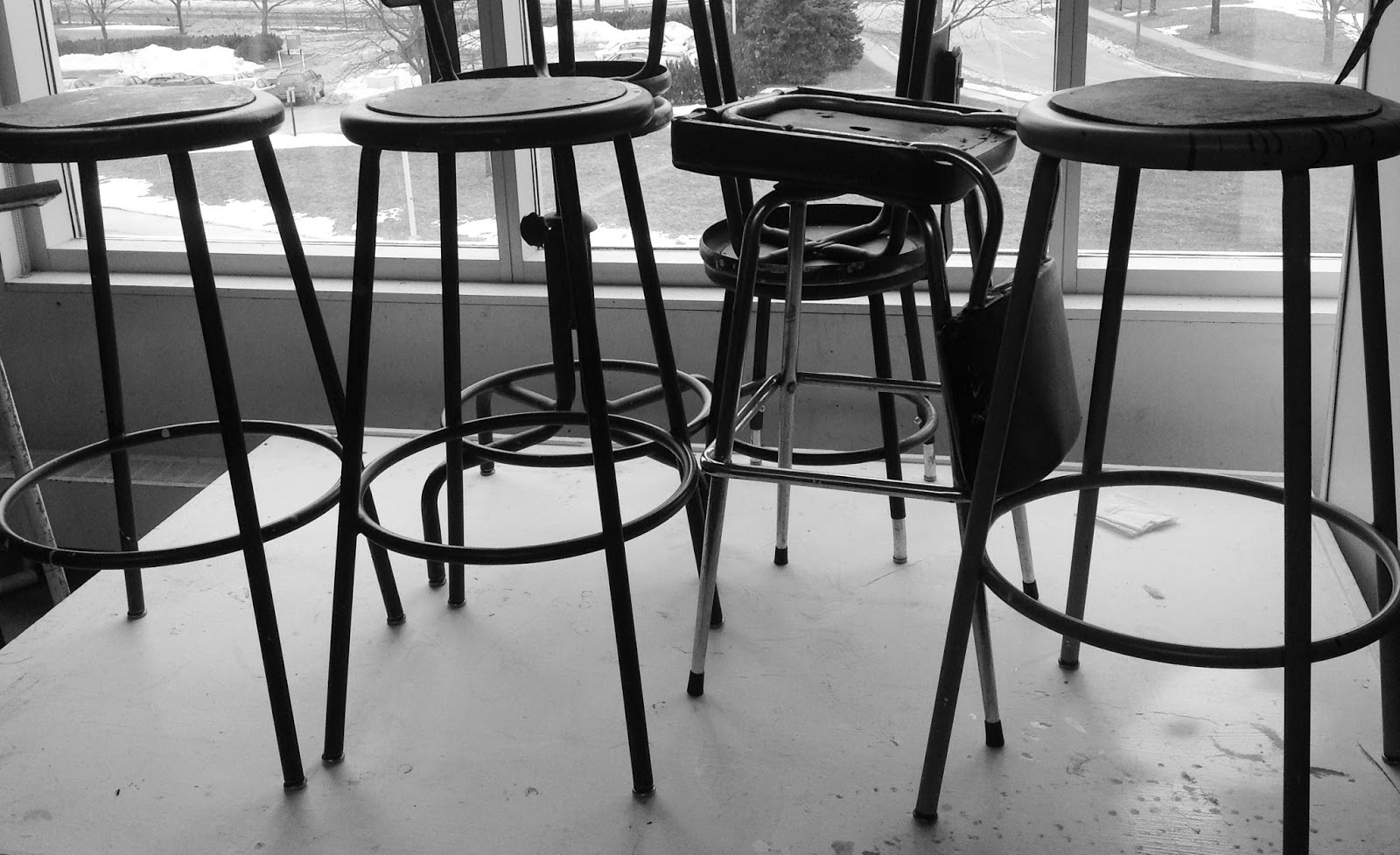
Point. Line. Plane.
Here are some images that are all representations of either a Point. Line. Plane. Or Both. I am not big on picture editing (At least not to the extreme) so most of these are edited with a simple crop, contrast adjustment, or hue/saturation adjustment. I want these photos to hopefully speak for themselves. So I will just leave it at that.


Tuesday, January 14, 2014
Photoshop and Color Theory
In class this morning we began to experience with not only photoshop itself, but with using the different practices of color theory in the program itself. As already being experienced with photoshop this assignment came as easy but interesting. I enjoyed being able to experiment with the different screen effects and the effects they were able to have on the design. Below are the three different designs I came up with. My favorite of the three is the image I posted last. The reason this one is my favorite is because I think the colors blend really well together and the image is overall cohesive. I think the three pieces in this collection although they are all different, I think together they fit as a group really well with my choices of color, shape, and style.


Monday, January 13, 2014
Digital Artists and Designers
I do have to start this post off by admitting that I am not very familiar with many different graphic designers/ logo designers/ or digital artists. So for my first artist of inspiration I am going with an artist who doesn't quite fit into those categories but is definitely an inspiration for my creative flow: Dr. Suess. I always have had a really strong connection with Dr. Suess growing up (We share a birthday) But as i've gotten older I have gained a larger appreciation for his art. He has this certain stylistic quality in his work that I just find to be so mesmerizing and interesting. Although many of his more famous works are children's works he has quite a larger range of works that many people are unfamiliar with.


Second, one of my favorite digital artists is Odwin Rensen, he has a large collection of both oil paintings as well as digital paintings. His digital paintings are very well detailed and realistic looking. A lot of his digital paintings have some very similar styles such as a realistic person and a more playful background which differentiates from some of his other work.
A designer who I look up to on a more well known scale would have to be Paul Rand. He has designed quite a few different well known logos which I have below. Many of the logos he was worked on are logos that many of us use and see in our everyday life, and most people couldn't even name who created them.
Representitive Works
Here are a few pieces of my work that I think overall gives a good representation of me and my design skills, abilities, and style. I am excited to be starting my Digital Print Based Media class because this is the first class at UT that I have taken that I personally believes will help me with my overall goals and desires in the graphic design field.
My first work is a logo I designed for O'Briens Greenhouse, I was really happy with how cohesive and together this logo came out. I enjoyed being able to play on both the name of the company and the company itself.

Next I chose a shot glass design that was used for a Sorority here at the University of Toledo. The Formal event was "Diamonds are a Girls best friend". I enjoyed not only working on this logo but being able to see the finished product as well.

Last but not least, this is a logo design I did for a Hula-Hooping troop called the Northern Lights. They did not choose this logo for there final design, but I believe that this design was the most fitting choice. I love the way the colors and the shapes all come together in this logo for the final design shown below.

Subscribe to:
Comments (Atom)